How to Use Colour Psychology to Boost Desk Productivity
Walk past your desk in the morning and it has already said something to you. A red in-tray overflowing with paperwork, a navy notebook, a mustard mug, a grey wall you never chose. Colour is the first thing your eye processes, often before you consciously read a word, and it quietly sets the tone of the next few hours: brisk, calm, restless or inviting. You do not need a designer or a full refurbishment to change that tone. A notebook cover, a pen pot, a desk mat and the bulb in your lamp are usually enough. This is not magic. It is the sensible business of removing friction and adding cues that nudge you towards the work you meant to do.
What colour can and cannot do at a desk
Colour has reliable, well-documented associations: blue tends to read as calm and dependable, green as balanced and restful, yellow as cheerful and alerting, red as urgent and attention-grabbing. Those associations are broadly consistent across cultures, though not universally so, and they shift with context — the same shade can feel warm on a cushion and alarming on an invoice stamp.
What colour will not do is write your report. Effects on mood and alertness are real but modest, and they vary from person to person, so the goal is not a scientifically perfect palette. It is a desk that supports the kind of attention you need today. Two things matter more than the exact hue: how saturated it is, and how much of it you can see. A saturated red covering half your field of view will affect you far more than a small red object you handle now and then.
Audit what is already there
Before buying anything, look at your desk from your chair as you would on a normal working morning. Note the three largest coloured surfaces in your line of sight. Often these are the wall in front of you, the desk surface or mat, and something bulky like a storage box, a lamp or a chair.
Ask a simple question about each: does this make me want to settle down and work, or does it make me feel hurried, tired or indifferent? Many desks end up with an accidental palette — several strong reds and oranges, a lot of glossy black, or a wash of grey with no contrast at all. Writing down what you actually see, rather than what you think is there, is the most useful step in the whole process.
Blue: for work that needs a long attention span
Blue is the safest default for concentrated tasks. It is associated with steadiness and lowered arousal, which suits editing, writing, coding, budgeting and anything where you need to sit still and follow a thread. A deep ink blue notebook, a slate blue desk mat or a denim-blue chair can all do the job without shouting.
One caution applies to light rather than pigment: cool blue-white light in the evening can make it harder to wind down, so keep the cool tones for daytime and switch to a warmer bulb after dark.
Green: the colour that helps you keep going
Green sits comfortably between calm and fresh, which makes it useful for long sessions rather than short sprints. A small plant is the obvious choice and brings texture as well as colour; just check it suits the light your desk gets, and water it on a fixed day so it does not become another source of low-level guilt. If plants and you have a difficult history, a sage green pen pot, a green felt noticeboard or a single green folder will do the same quiet work.
Yellow and orange: short bursts and warmth
Warm tones raise alertness. Yellow is bright and noticing, which is why it works well on a sticky-note pad, a highlighter or the cover of a project notebook. Spread across a whole wall, though, it can tip from cheerful into restless, and some people find large areas of saturated yellow genuinely irritating.
Orange and terracotta are friendlier and slightly more energising, good for the admin you keep avoiding — the calls, the filing, the expenses. A terracotta mug or a burnt orange document tray makes those tasks feel a little less like punishment.
Red: a small, deliberate dose
Red commands attention, which is exactly why it should be rare on a working desk. Keep it for one job: a single tray or tray-sized box holding the three things that genuinely must be finished today. Everything else goes elsewhere. If your desk is already red-heavy, swap one large item for a neutral and notice the change in how the space feels.
Using the colours you already own
Once you know what you are aiming for, match the shade to the task:
- Deep blue or navy — long, quiet work: writing, editing, analysis, month-end reconciliation.
- Sage or forest green — all-day sessions where you need to stay steady rather than sprint.
- Mustard or soft yellow — note-taking, planning and brainstorming, where you want to spot things quickly.
- Terracotta or burnt orange — calls, admin and tasks that need a bit of forward momentum.
- Red — one small item only, reserved for work that is due today.
- Off-white, warm grey, wood — the background that lets the rest do its job.
Neutrals, texture and the space around you
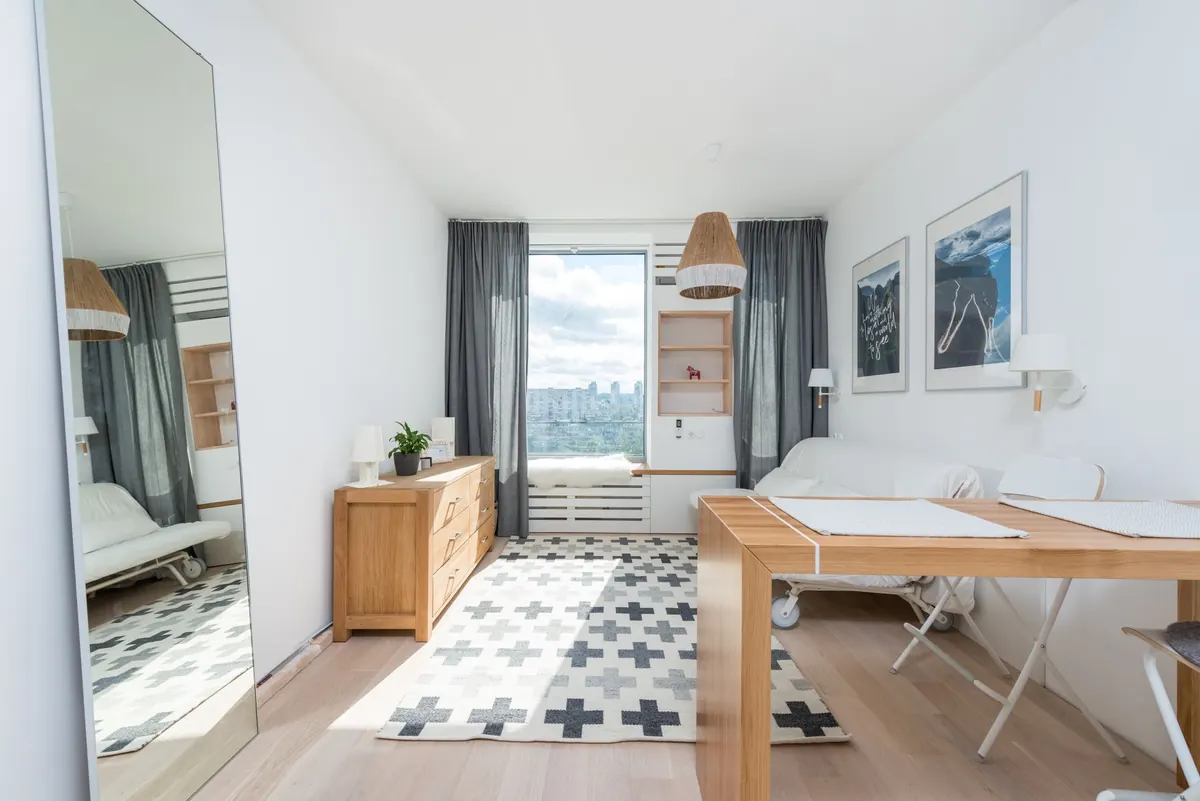
Neutrals are not boring; they are the reason the other colours read as anything at all. Plain white and cool grey can feel clinical in a small room, so warm them slightly with wood, cork, linen or a felt mat. Texture matters as much as hue: a matte surface absorbs light and feels calmer than something glossy that throws reflections across your keyboard.
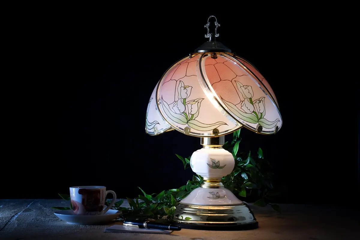
Finish with light. Where you can, angle your desk towards daylight without sitting in glare — a desk in front of a window but off to one side is usually more comfortable than one facing it directly. A small warm lamp gives you a way to create a defined pool of light when the afternoon fades, which helps mark the last stretch of the day as work time.
A practical two-week experiment
You can test all of this without spending much, or anything, by running one small experiment at a time. Commit to a fortnight and then judge the results by how you actually worked, not by how the desk looks in a photograph.
- Choose one goal: focus, energy or calm. Pick only one.
- Find the surface that dominates your view — desk mat, wall, lamp or storage — and change the colour of that single item.
- Remove or cover one competing colour, especially a large red or black element you did not choose.
- Add one small object in your target shade where your hand naturally rests: a pen pot, a coaster, a folder, a tray.
- Keep the palette to two main colours plus a neutral background. More than that and the cues start cancelling each other out.
- At the end of the fortnight, ask whether you sat down more easily, got distracted less, or simply liked being there more. Keep what helped, change what did not.
Colour will not fix a job you dislike or a schedule with no gaps in it. It can, though, make the first two minutes at your desk easier, and those two minutes are often where a good working day begins.
Photo: Elizabeth Iris / Pexels